# ggplot laden
library(ggplot2)

# Datenframe vorbereiten
d=data.frame(c=colors(),
             y=seq(0, length(colors())-1)%%66,
             x=seq(0, length(colors())-1)%/%66)
# Alle Farben plotten
p <- ggplot() +
  scale_x_continuous(name="", breaks=NULL, expand=c(0, 0)) +
  scale_y_continuous(name="", breaks=NULL, expand=c(0, 0)) +
  scale_fill_identity() +
  # weisse Boxen für Text
  geom_rect(data=d, mapping=aes(xmin=x,
                                xmax=x+1,
                                ymin=y,
                                ymax=y+1),
            fill="white") +
  # Farbboxen
  geom_rect(data=d, mapping=aes(xmin=x+0.05,
                                xmax=x+0.95,
                                ymin=y+0.5,
                                ymax=y+1,
                                fill=c)) +
  # Farbnamen
  geom_text(data=d, mapping=aes(x=x+0.5, y=y+0.5, label=c),
            colour="black", hjust=0.5, vjust=1, size=3)

# Plot ansehen
p37 Diagramme plotten
Ich möchte Diagramme plotten!
37.1 Alle R-Farben
Ich möchte alle Farben, die per colors() ausgegeben werden, in eine Übersichtsgrafik plotten.
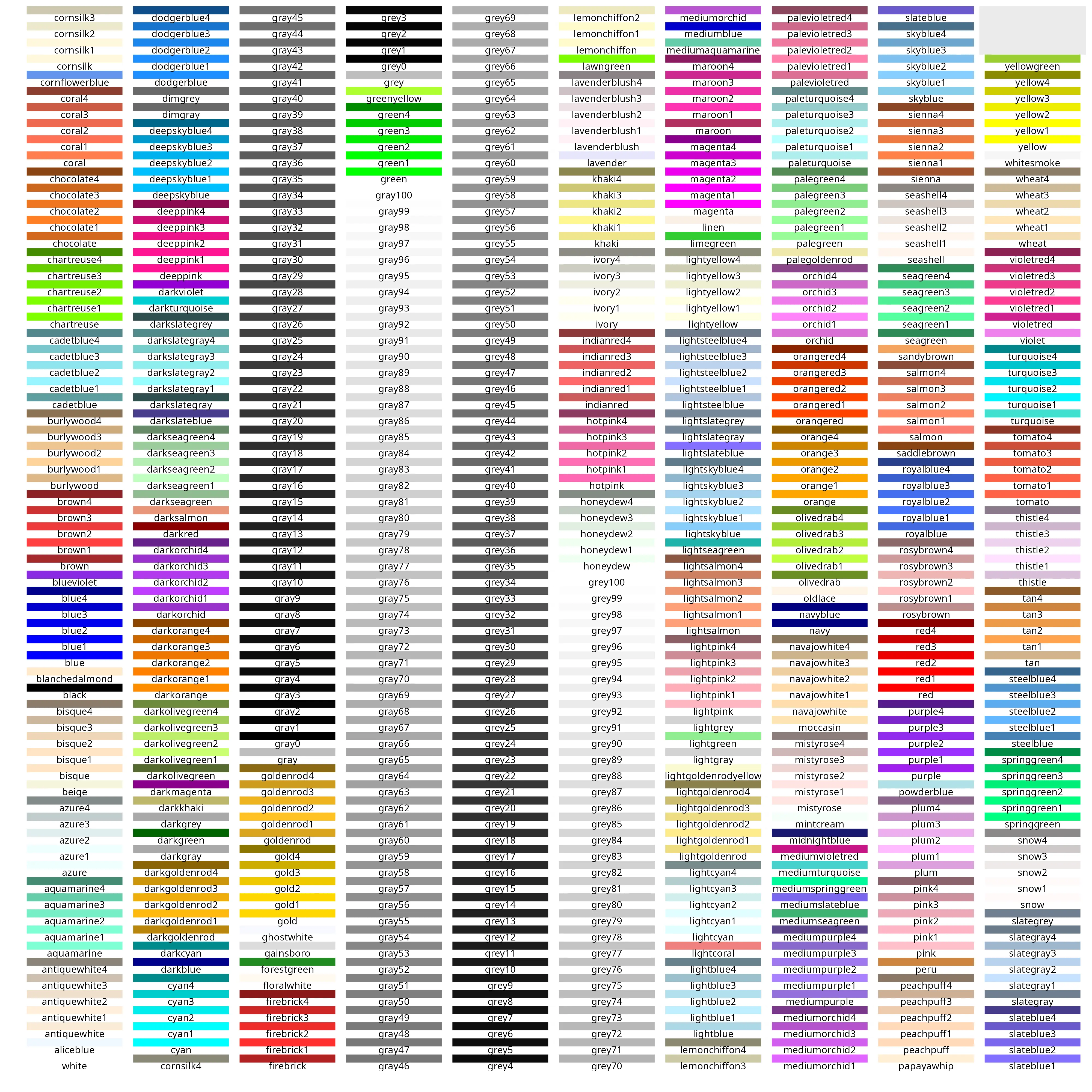
# Plot speichern
ggsave("rbase-Farben.png",
       plot= p,
       units="px",
       width=4000,
       height=4000,
       dpi=300)
37.2 Normalverteilung
Zum Plotten von Normalverteilungen kann man mit der Funktion plot() so vorgehen:
# erstelle Werte von -4 bis 4 in 0.005er-Schritten
x <- seq(-4, 4, by=0.005)

# plotte die Standardnormalverteilung
plot(x,dnorm(x))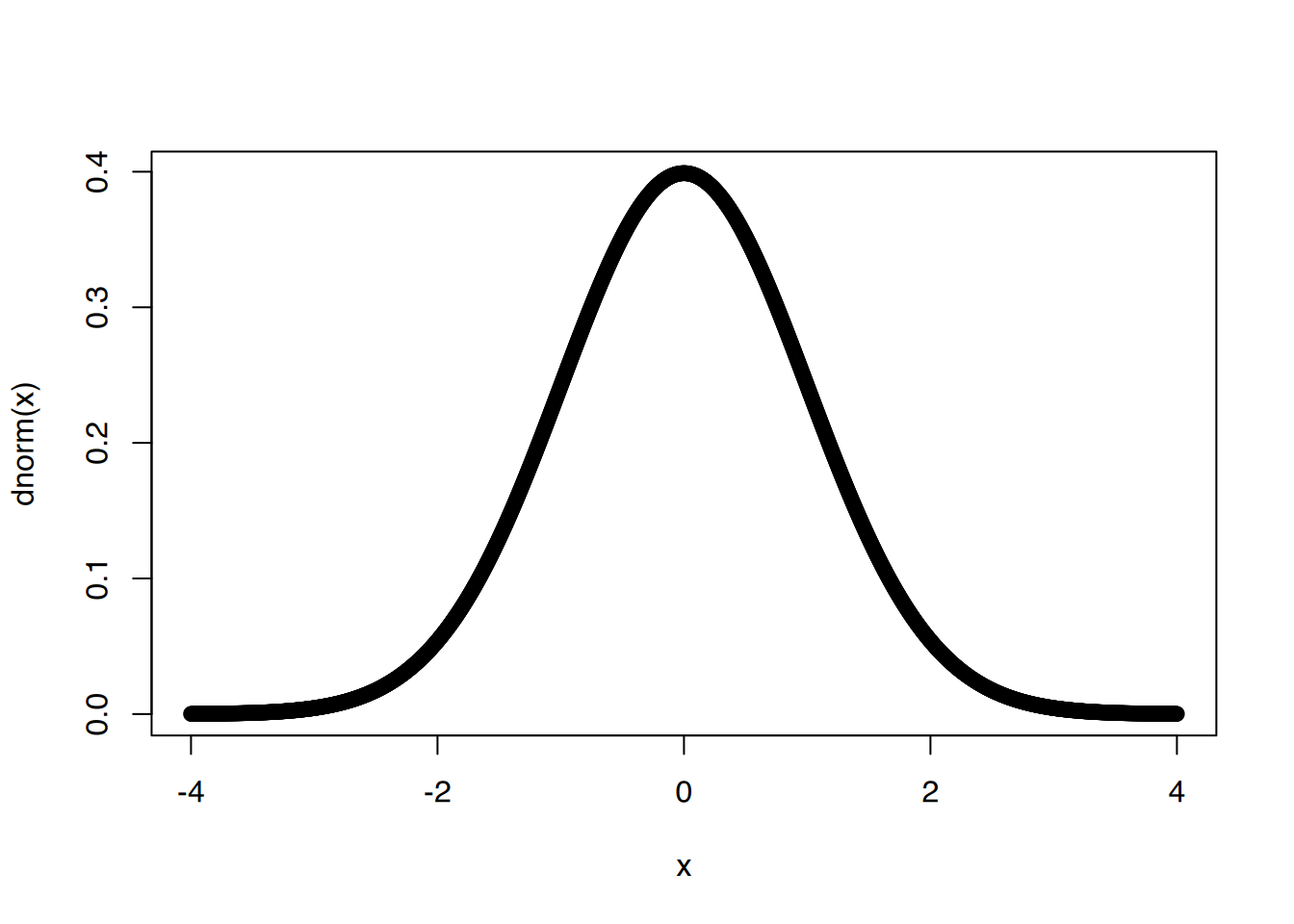
# etwas hübscher
plot(x,dnorm(x), col="blue", type="l", xlab="x", ylab="f(x)", main="Standardnormalverteilungen")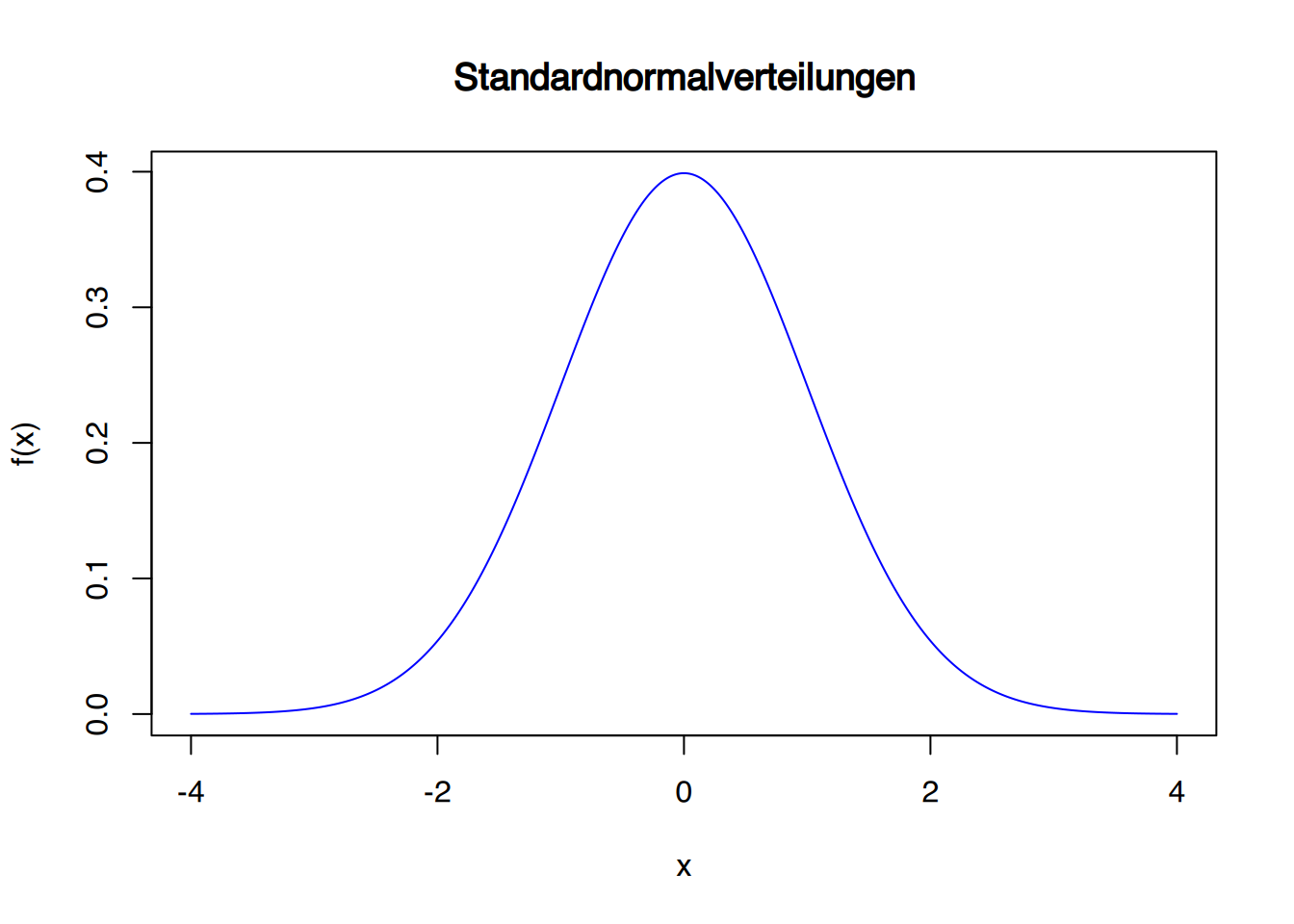
# mit Mittelwert 2 und sd = 0,5
plot(x,dnorm(x,mean=2,s=0.5), col="darkblue", type="l", xlab="x", ylab="f(x)", main="Normalverteilungen")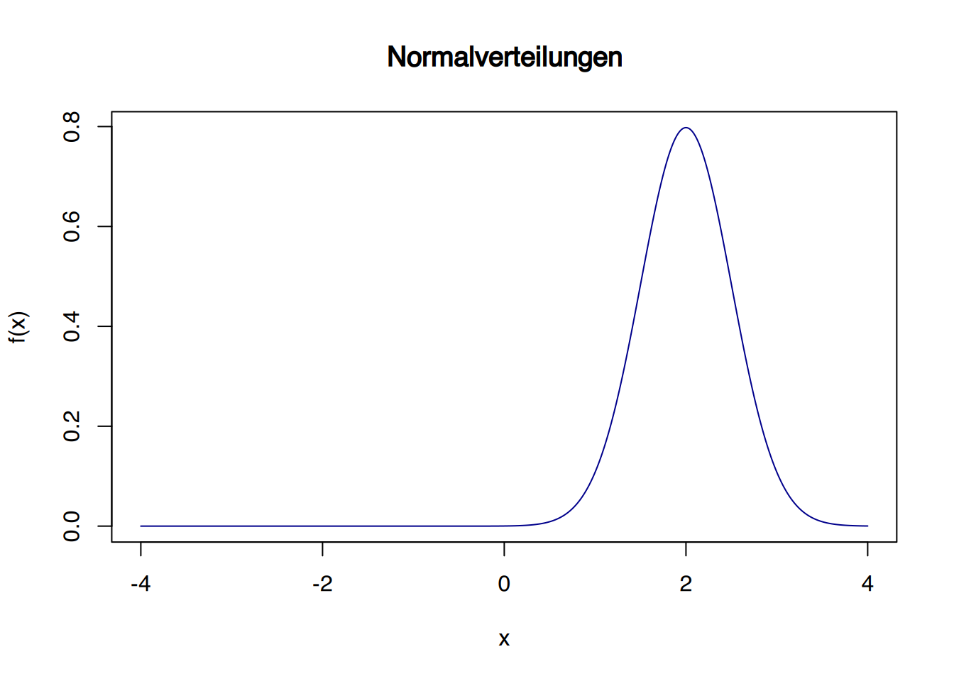
# mit Mittelwert 2 und sd = 2
plot(x,dnorm(x,mean=2,s=2), col="darkorchid", type="l", xlab="x", ylab="f(x)", main="Normalverteilungen")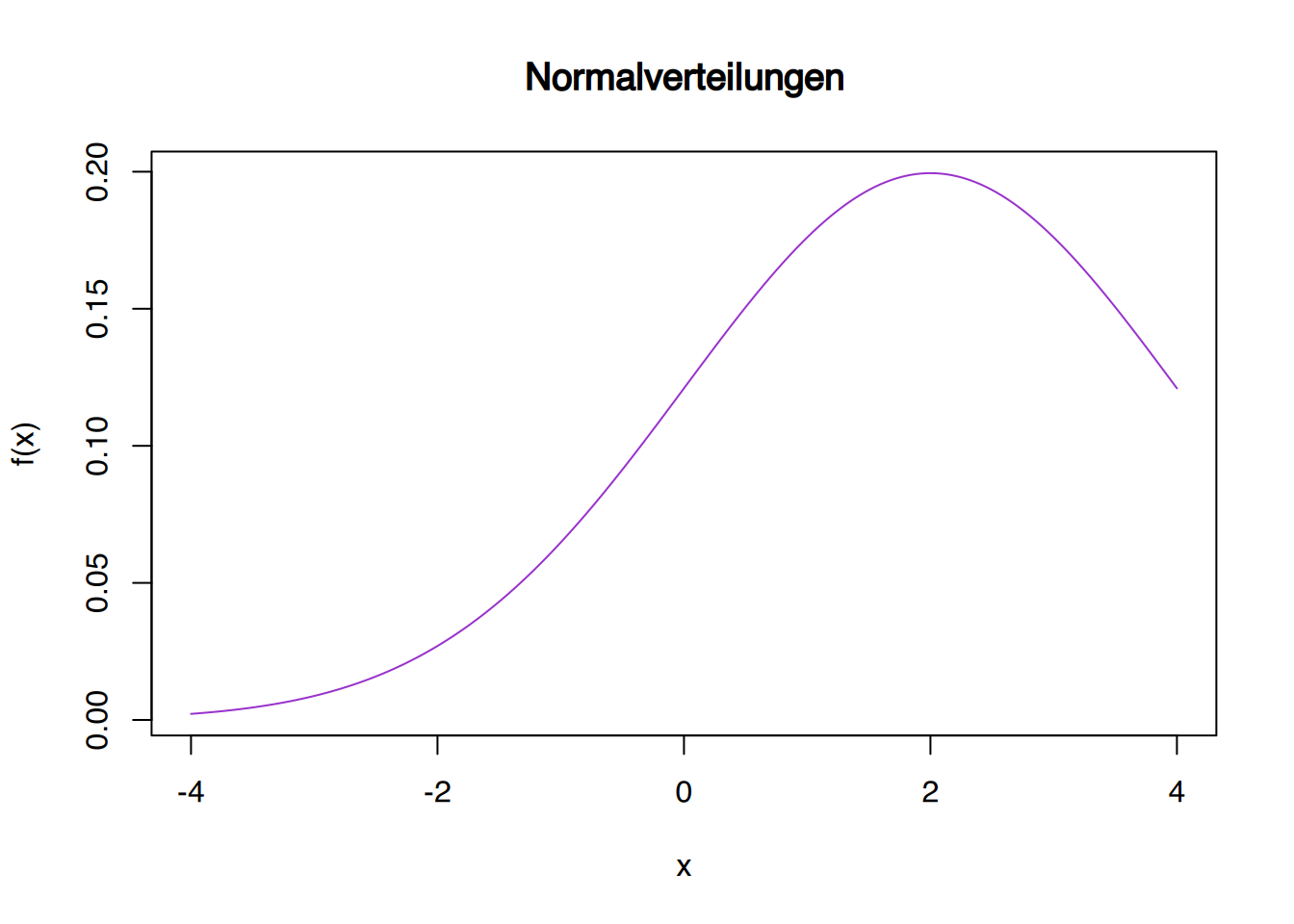
# erzeuge neue Werte von -3 bis 6
x <- seq(-3,6, by=0.005)

# Alles zusammen plotten
plot(x,dnorm(x,mean=2,s=0.5), col="blue", type="l", xlab="x", ylab="f(x)",main="Normalverteilungen")
lines(x,dnorm(x,mean=0,s=1), col="black")
lines(x,dnorm(x,mean=2,s=2), col="darkorchid")
text(0,.45,"N(0;1)")
text(2.8, 0.6, "N(2;0.5)", col="blue")
text(5, 0.1, "N(2;2)", col="darkorchid")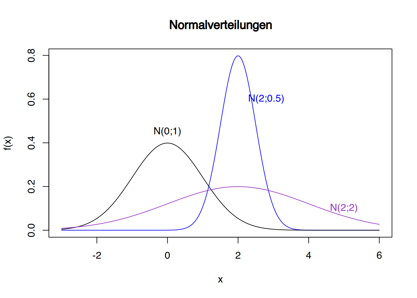
Mit ggplot kann es so aussehen:
# aktiviere ggplot
library(ggplot2)

# erzeuge Werte von -3 bis 3
x <- seq(-3,3, by=0.005)

# übergebe in ein data.frame
df <- data.frame(x)

# ggplot erstellen
p <- ggplot(data=df, aes(x)) +
                     xlim(-4,4) + ylim(0,0.5) +
                     xlab("x") + ylab("Dichtefunktion") +
                     ggtitle("Normalverteilungen")
p + stat_function(fun=dnorm, args=(c(mean=0,sd=1)), colour="black")+
annotate(geom="text", x=0, y=0.42, label="N(0;1)", color="black") 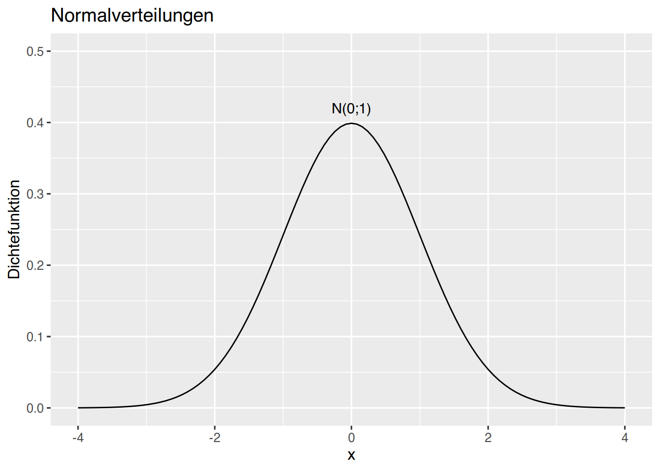
# erzeuge Werte von -3 bis 6
x <- seq(-3,6, by=0.005)

# übergebe in ein data.frame
df <- data.frame(x)

# ggplot erstellen
p <- ggplot(data=df, aes(x)) +
                     xlim(-3,6) + ylim(0, 0.8) +
                     xlab("x") + ylab("Dichtefunktion") +
                     ggtitle("Normalverteilungen")
p + stat_function(fun=dnorm, args=(c(mean=0,sd=1)), colour="black")+
  annotate(geom="text", x=0, y=0.42, label="N(0;1)", color="black")+
  stat_function(fun=dnorm, args=(c(mean=2,sd=0.5)), colour="blue") +
  annotate(geom="text", x=3, y=0.6, label="N(2;0.5)", color="blue")+
  stat_function(fun=dnorm, args=(c(mean=2,sd=2)), colour="darkorchid") +
annotate(geom="text", x=5, y=0.1, label="N(2;2)", color="darkorchid") 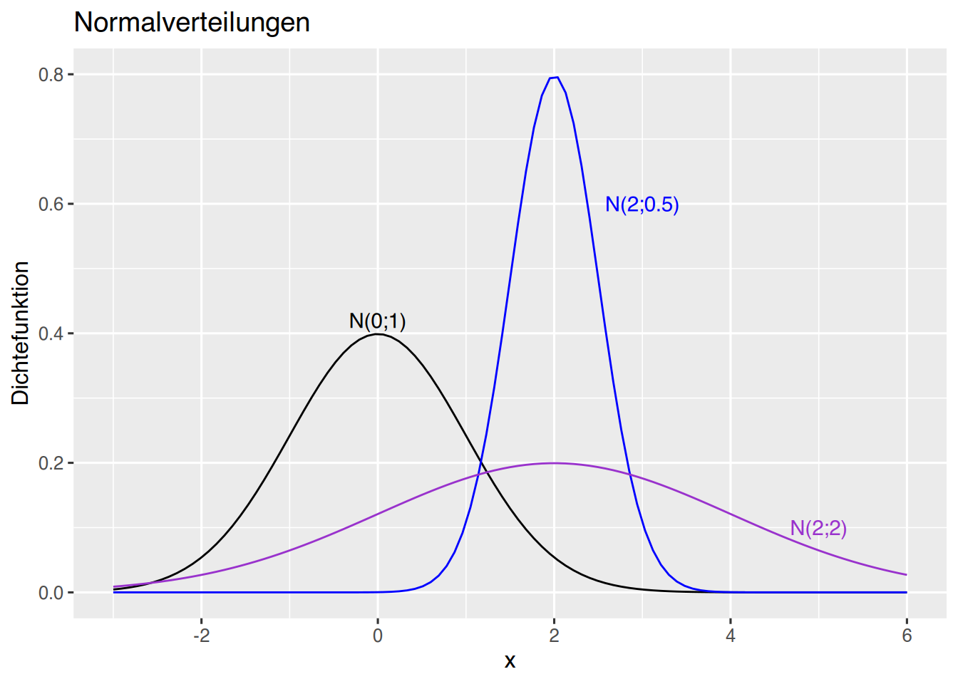
# erzeuge X-Werte
df    <- data.frame(x=seq(-3,3, by=0.005))
# berechne Y-Werte
df$y  <- dnorm(df$x)
# Setze Cuts
df$sd <- cut(df$x, breaks = c(-Inf, 1 *(-2:2), Inf))

# plotte als area
ggplot(df, aes(x, y, fill=sd)) + geom_area()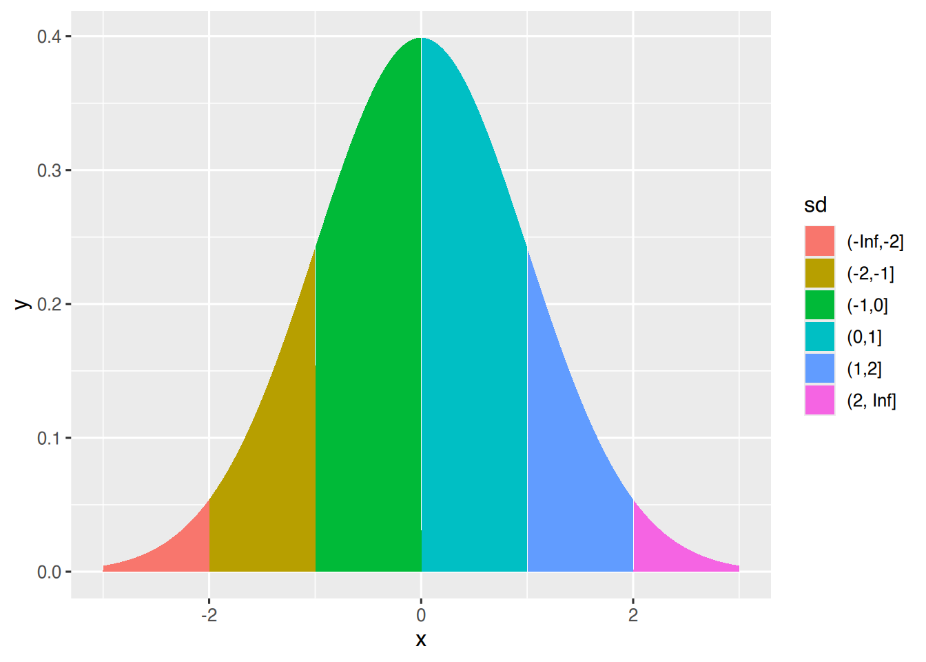
Erzeugen wir den Bereich von 1 Standardabweichung.
df <- data.frame(x=seq(-3,3, by=0.005))
df$y  <- dnorm(df$x)
df$sd <- cut(df$x, breaks = c(-1,1))
df <- rbind(df, data.frame(x=c(-1, 1), y=c(0,0),sd=c(-1,1)))
df$sd <- forcats::fct_explicit_na(df$sd, na_level="x")

ggplot(df, aes(x, y, fill=sd)) +
  ggtitle("Standardnormalverteilung", subtitle = "Bereich von 1 Standardabweichung") +
  geom_area() + theme(legend.position = "none") +
  geom_vline(xintercept=0, linetype="dotted")+
  geom_vline(xintercept=-1, linetype="dashed", col="blue", size=1)+
  geom_vline(xintercept=1, linetype="dashed", col="blue", size=1)+
  scale_fill_manual(name=c("x","(-1,1]"), values=c("skyblue", "snow3"))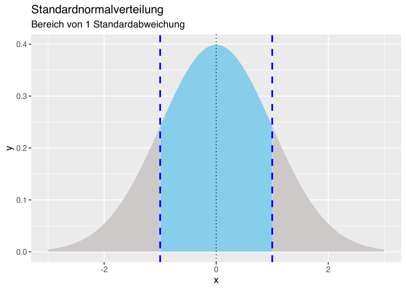
Nun erzeugen wir den Bereich von 2 Standardabweichungen.
df    <- data.frame(x=seq(-3,3, by=0.005))
df$y  <- dnorm(df$x)
df$sd <- cut(df$x, breaks = c(-2,2))
df    <- rbind(df, data.frame(x=c(-2, 2), y=c(0,0),sd=c(-2,2)))
df$sd <- forcats::fct_explicit_na(df$sd, na_level="x")

ggplot(df, aes(x, y, fill=sd)) +
  ggtitle("Standardnormalverteilung", subtitle = "Bereich von 2 Standardabweichung") +
  geom_area() + theme(legend.position = "none") +
  geom_vline(xintercept=0, linetype="dotted")+
  geom_vline(xintercept=-2, linetype="dashed", col="purple3", size=1)+
  geom_vline(xintercept=2, linetype="dashed", col="purple3", size=1)+
  scale_fill_manual(name=c("x","(-2,2]"), values=c("purple3", "snow3"))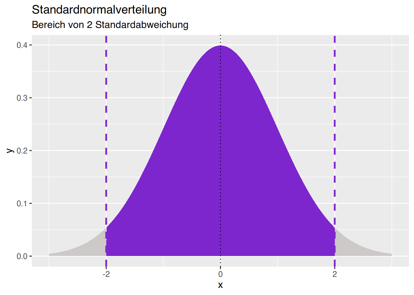
Erzeugen wir die Fläche, in der 95% der Werte liegen, also von 1,96 Standardabweichungen.
df    <- data.frame(x=seq(-3,3, by=0.005))
df$y  <- dnorm(df$x)
df$sd <- cut(df$x, breaks = c(-1.96, 1.96))
df    <- rbind(df, data.frame(x=c(-1.96, 1.96), y=c(0,0),sd=c(-1.96,1.96)))
df$sd <- forcats::fct_explicit_na(df$sd, na_level="x")

ggplot(df, aes(x, y, fill=sd)) +
  ggtitle("Standardnormalverteilung", subtitle = "95% der Werte bei 1,96 sd") +
  geom_area() + theme(legend.position = "none") +
  geom_vline(xintercept=0, linetype="dotted")+
  geom_vline(xintercept=-2, linetype="dotted", col="purple3", size=0.5)+
  geom_vline(xintercept=2, linetype="dotted", col="purple3", size=0.5)+
  geom_vline(xintercept=-1.96, col="chartreuse4", size=0.5)+
  geom_vline(xintercept=1.96, col="chartreuse4", size=0.5)+
  scale_fill_manual(name=c("x","(-1.96,1.96]"), values=c("seagreen3", "snow3"))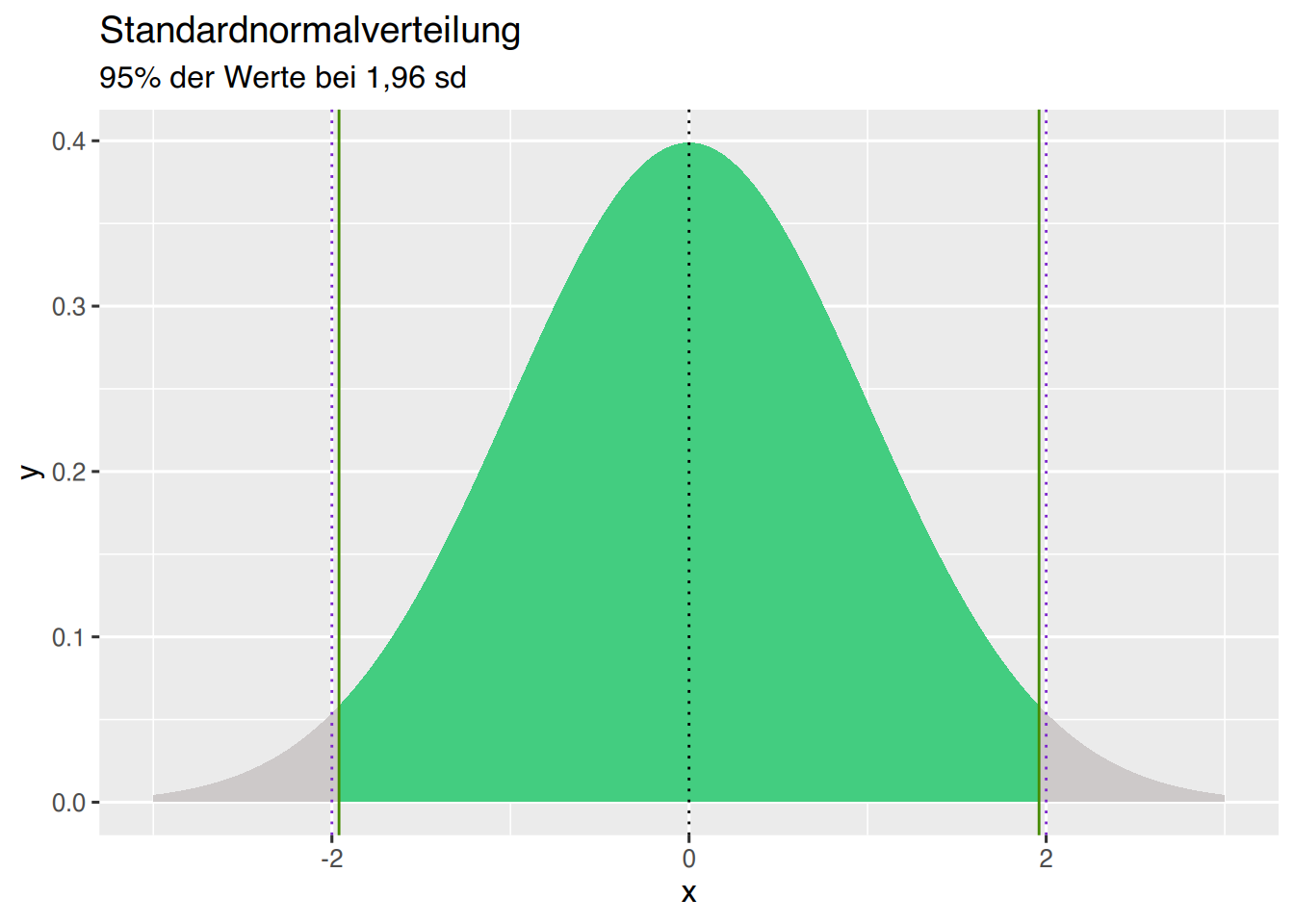
Dieser Code kann für die Erzeugung der Grafiken von Tabelle Tabelle 42.1 und Tabelle 42.2 verwendet werden.
df    <- data.frame(x=seq(-3,3, by=0.005))
df$y  <- dnorm(df$x)
df$sd <- "B"
df$sd[df$x < 1.4] <- "A"

ggplot(df, aes(x, y, fill=sd)) +
  geom_area() + theme(legend.position = "none") +
  geom_vline(xintercept=0, linetype="dotted")+
  geom_vline(xintercept=1.4, col="blue", size=0.5)+
  ylab("") + scale_fill_manual(values=c("skyblue", "snow3"))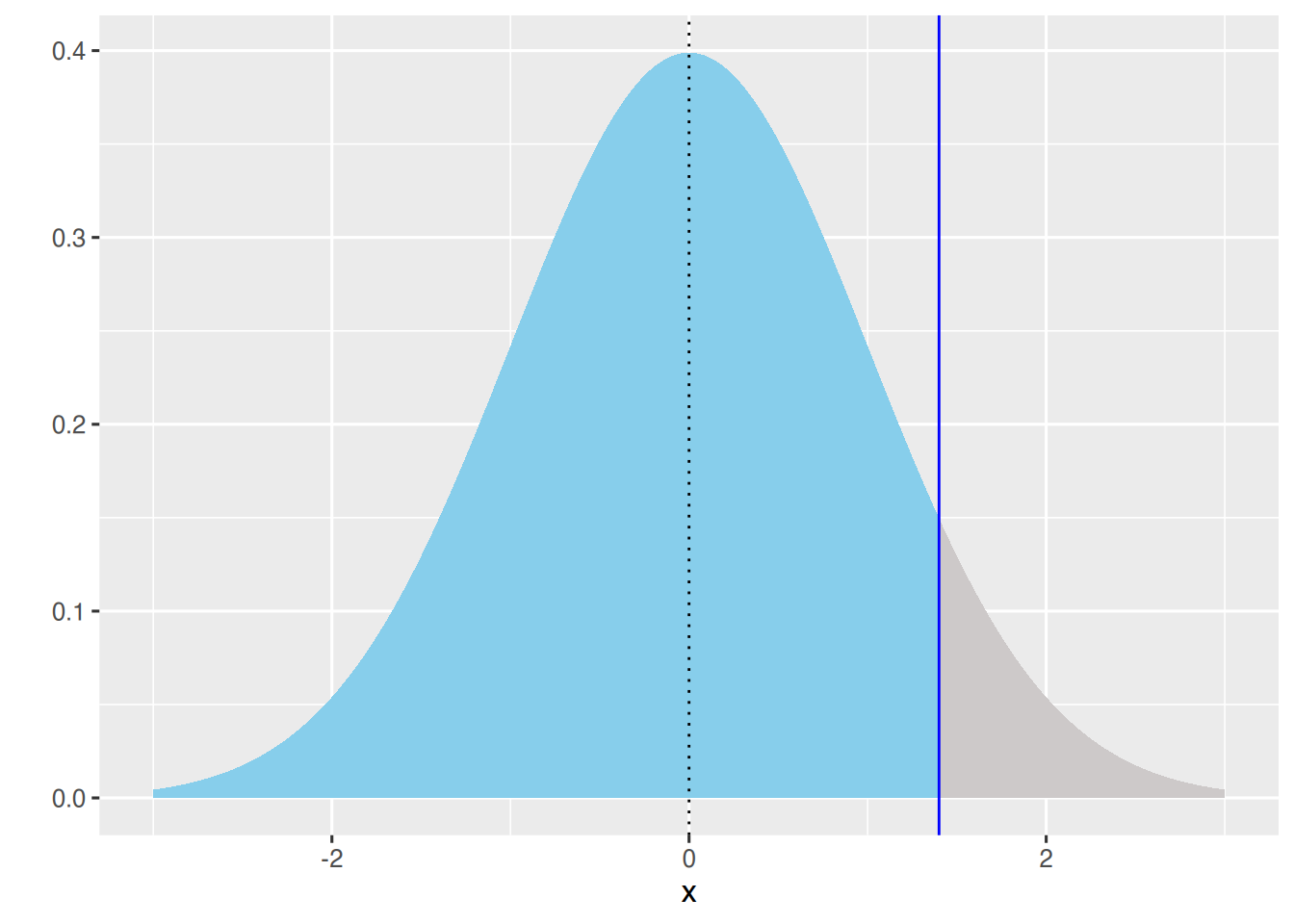
df    <- data.frame(x=seq(-3,3, by=0.005))
df$y  <- dnorm(df$x)
df$sd <- "B"
df$sd[df$x < 1.4] <- "A"

ggplot(df, aes(x, y, fill=sd)) +
  geom_area() + theme(legend.position = "none") +
  geom_vline(xintercept=0, linetype="dotted")+
  geom_vline(xintercept=1.4, col="blue", size=0.5)+
  ylab("") + scale_fill_manual(values=c("snow3", "skyblue"))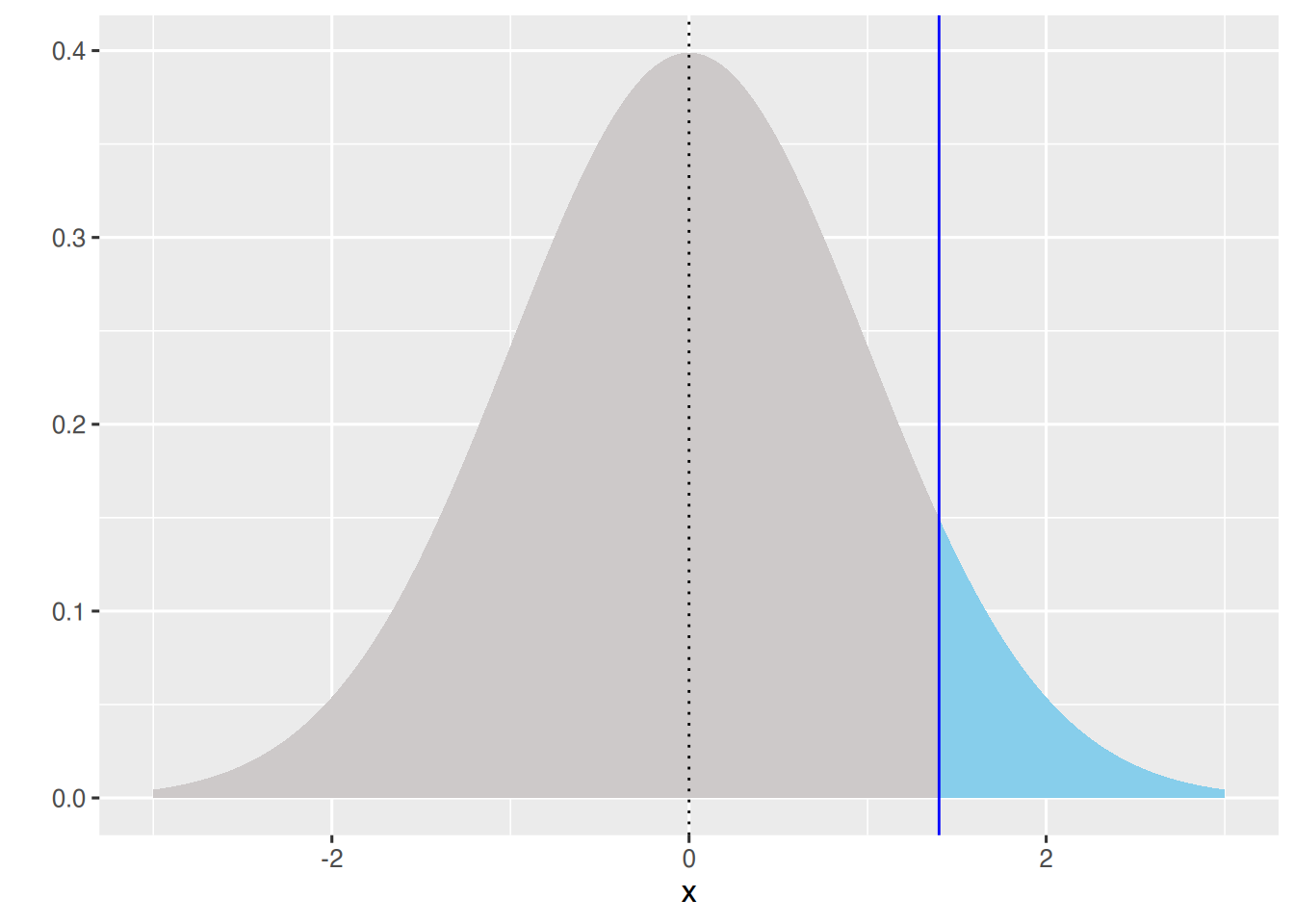
37.3 t-Verteilung
Die t-Verteilung kann mit ggplot geplottet werden.
# Erzeuge x-werte
df <- data.frame(x=seq(-3,3, by=0.005))

# Grundlegene Plotangaben
p <- ggplot(data=df, aes(x)) +
  # begrenze die Achsen
  xlim(-3,3) + ylim(0, 0.4) +
  # Achsen-Titel
  xlab("x") + ylab("Dichtefunktion") +
  # Plot-Titel
  ggtitle("t-Verteilungen", subtitle = "nach Freiheitsgraden")

  # t-Verteilung plotten
p +
  stat_function(fun=dt, args=list(df=1), col="black") +
  # Textfeld hinzufügen
  annotate(geom="text", x=0, y=0.25, label="df=1", color="black")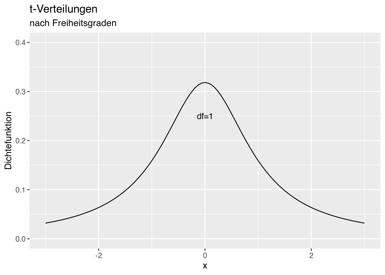
Dem Plott können weitere Freiheitsgrade hinzugefügt werden.
# t-Verteilungen plotten
p +
  stat_function(fun=dt, args=list(df=1), col="black") +
  annotate(geom="text", x=0, y=0.25, label="df=1", color="black")+
  stat_function(fun=dt, args=list(df=2), col="blue") +
  annotate(geom="text", x=0, y=0.37, label="df=2", color="blue")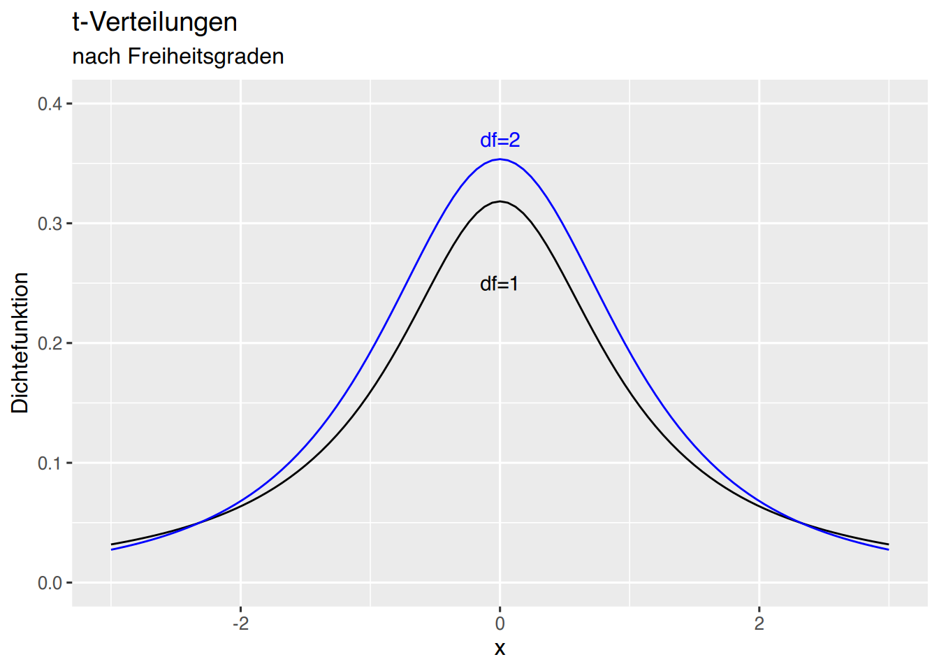
Wenn die t-Werte bereits berechnet wurden, kann eine alternative Vorgehensweise so aussehen:
# berechne t-Werte für Freiheitsgrade 1 bis 5
x=seq(-3,3, by=0.005)
df <- data.frame(
    x,
    df1 = dt(x,df=1),
    df2 = dt(x,df=2),
    df3 = dt(x,df=3),
    df4 = dt(x,df=4),
    df5 = dt(x,df=5)
)

# wandle ins Format "long table" um
df <- pivot_longer(df, cols=c(df1, df2, df3, df4, df5))

# grundlegende Ploteinstellungen
p <- ggplot(data=df, aes(x,value)) +
  xlim(-3,3) + ylim(0, 0.4) +
  xlab("x") + ylab("Dichtefunktion") +
  ggtitle("t-Verteilungen", subtitle = "nach Freiheitsgraden")

# plotte t-Verteilungen
p + geom_line(aes(col=name))+
  labs(col="Freiheitsgrade")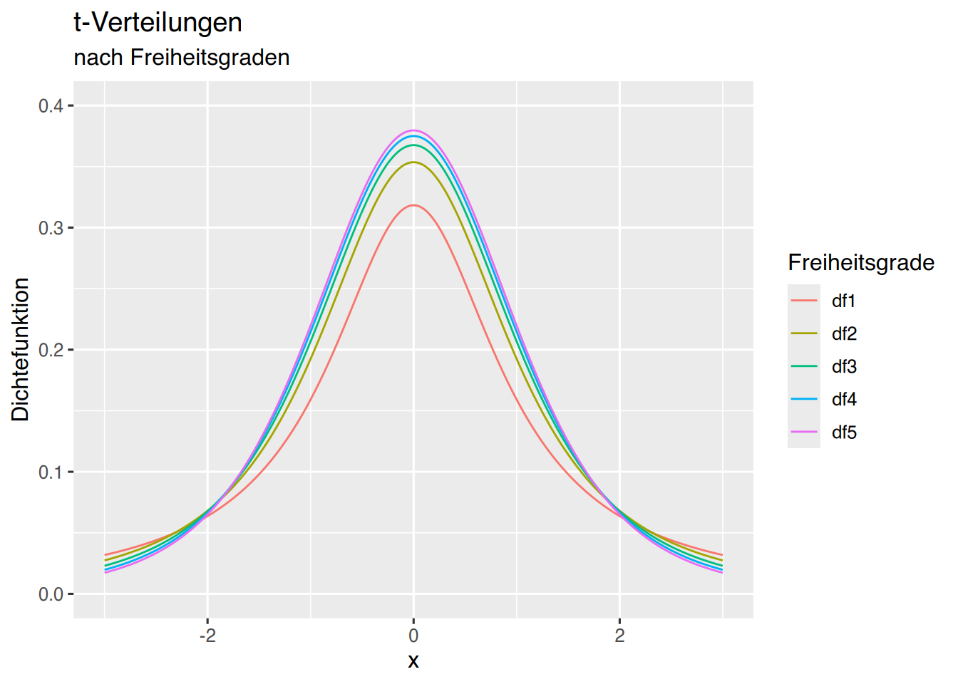
37.4 \(\chi^2\)-Verteilung
Die \(\chi^2\)-Verteilung kann mit ggplot geplottet werden.
# Erzeuge x-werte
x=seq(0,25, by=0.005)
df <- data.frame(  x,
  df01 = dchisq(x, df=1),
  df05 = dchisq(x, df=5),
  df10 = dchisq(x, df=10),
  df15 = dchisq(x, df=15)
)

# erzeuge long-table
df <- pivot_longer(df, cols=c(df01, df05, df10, df15))

p <- ggplot(data=df, aes(x, value, fill=name)) +
  xlim(0,25) + ylim(0, 0.2) +
  xlab("x") + ylab("Dichtefunktion") +
  ggtitle("Chi^2-Verteilungen", subtitle = "nach Freiheitsgraden")
p + geom_line(aes(col=name,linetype=name))+
labs(col="Freiheitsgrade",linetype="")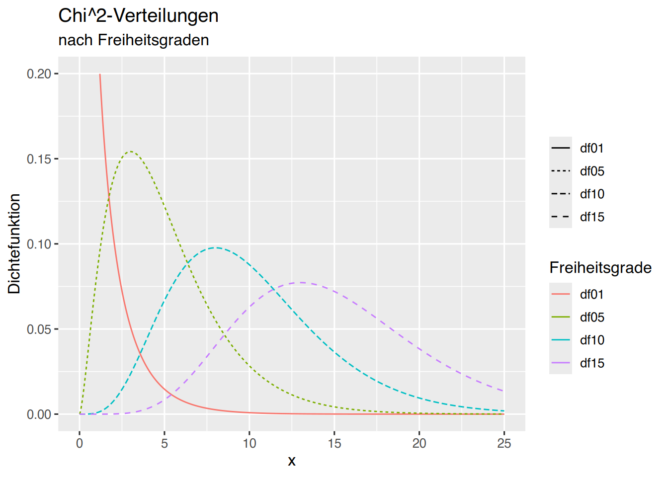
Die Fläche unterhalb der Kurve kann mit geom_area() erzeugt werden. Für df=1 lautet der Aufruf:
# erzeuge Dummy-Werte
x=seq(0,25, by=0.005)
# überführe in Datenframe
df <- data.frame(  x, df01 = dchisq(x, df=1))
ggplot(data=df, aes(x, df01)) +
  xlim(0,25)  + coord_cartesian(ylim=c(0, 0.2)) +
  xlab("Chi^2-Wert") + ylab("Dichtefunktion") +
  ggtitle("Chi^2-Verteilung", subtitle = "mit 1 Freiheitsgrad") +
  geom_line(col="#F8766D") +geom_area(fill="skyblue")
## Warning: Removed 1 row containing non-finite outside the scale range
## (`stat_align()`).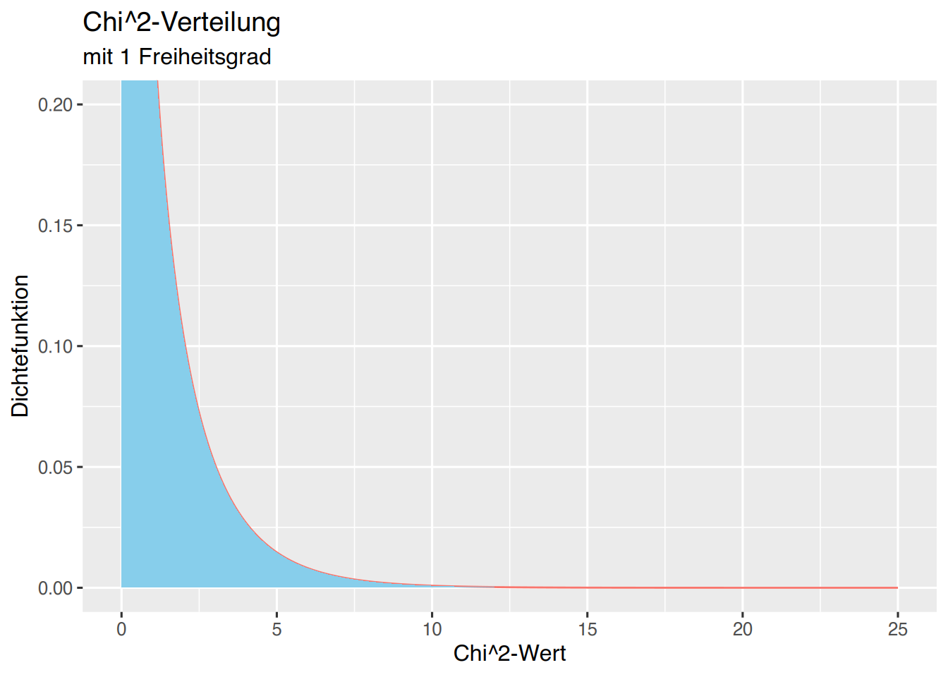
Ähnlich wie bei der Normalverteilung können wir die Fläche für bestimmte \(\chi^2\)-Werte einfärben. Bei einem Freiheitsgrad und \(\alpha=0,05\) ergibt sich ein kritischer \(\chi^2\)-Wert von 3,84. Der Flächenanteil unterhalb dieses Wertes lässt sich wie folgt darstellen:
# Dummy-Werte erzeugen
df <- data.frame(x=seq(0.005,25, by=0.005))
# Chi^2-Werte für df=1 erstellen
df$y  <- dchisq(df$x, df=1)
# Grenze bei 3.84 einziehen
df$sd <- cut(df$x, breaks = c(0.00, 3.84))
ggplot(df, aes(x, y, fill=sd)) +
  geom_area() + theme(legend.position = "none") +
  geom_line(aes(col="#F8766D")) +
  xlim(0,25) + coord_cartesian(ylim=c(0, 0.2)) +
  xlab("Chi^2-Wert") + ylab("Dichtefunktion") +
  ggtitle("Chi^2-Verteilung", subtitle = "mit 1 Freiheitsgrad")+
  geom_vline(xintercept=3.84, col="blue", size=0.5, linetype="dashed")+
  ylab("") + scale_fill_manual(values=c("skyblue", "snow3")) +
  annotate(geom="text", x=2, y=0.028, size=8,label="95%", color="blue")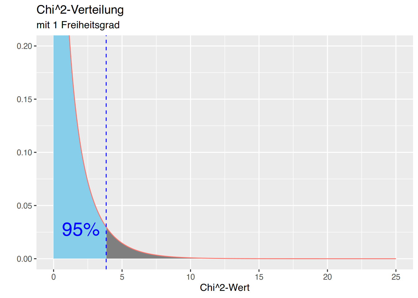
37.5 Poisson-Verteilung
Die Poisson-Verteilung kann mit ggplot geplottet werden.
# Erzeuge x-Werte
x=seq(0,25)
df <- data.frame(  x,
                   l1 = dpois(x, 1),
                   l2 = dpois(x, 2),
                   l4 = dpois(x, 4),
                   l9 = dpois(x, 9)
)

# erzeuge eine long-table
df <- pivot_longer(df, cols=c(l1, l2, l4, l9))

# plot vorbereiten
p <- ggplot(data=df, aes(x, value, fill=name)) +
  xlim(0,17) + ylim(0, 0.4) +
  xlab("x") + ylab("Dichtefunktion") +
  ggtitle("Poisson-Verteilungen", subtitle = "nach Lambda")
p + geom_line(aes(col=name,linetype=name))+
  labs(col="Lambda",linetype="")
## Warning: Removed 32 rows containing missing values or values outside the scale range
## (`geom_line()`).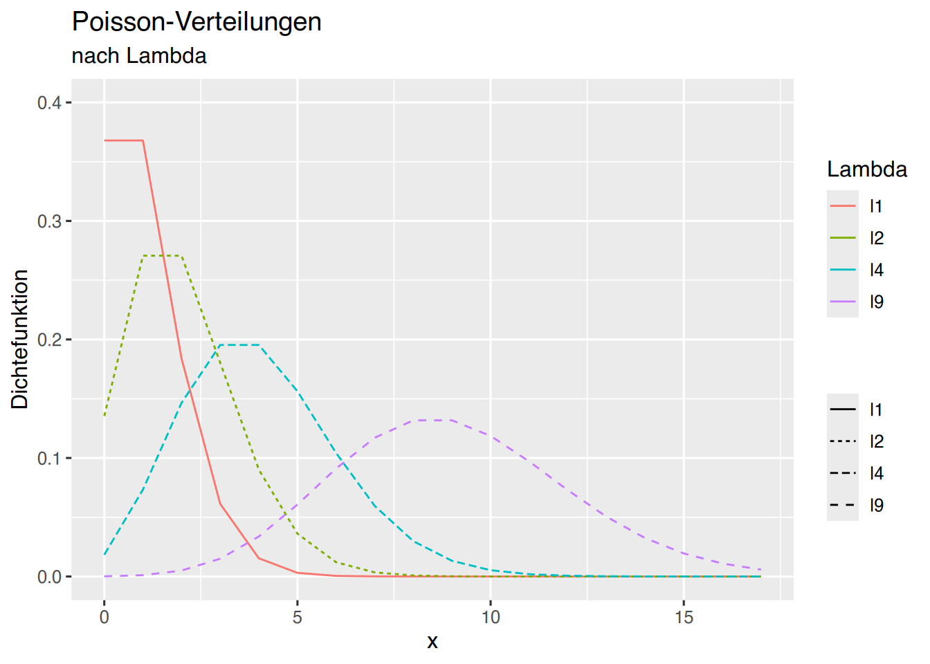
Da wir die Plot-Grundlagen in p gespeichert haben, können wir ergänzen:
p + geom_bar(aes(col=name,linetype=name), stat="identity", position="dodge")+
   geom_line(aes(col=name,linetype=name))+
  labs(col="Lambda",linetype="")
## Warning: Removed 36 rows containing missing values or values outside the scale range
## (`geom_bar()`).## Warning: Removed 32 rows containing missing values or values outside the scale range
## (`geom_line()`).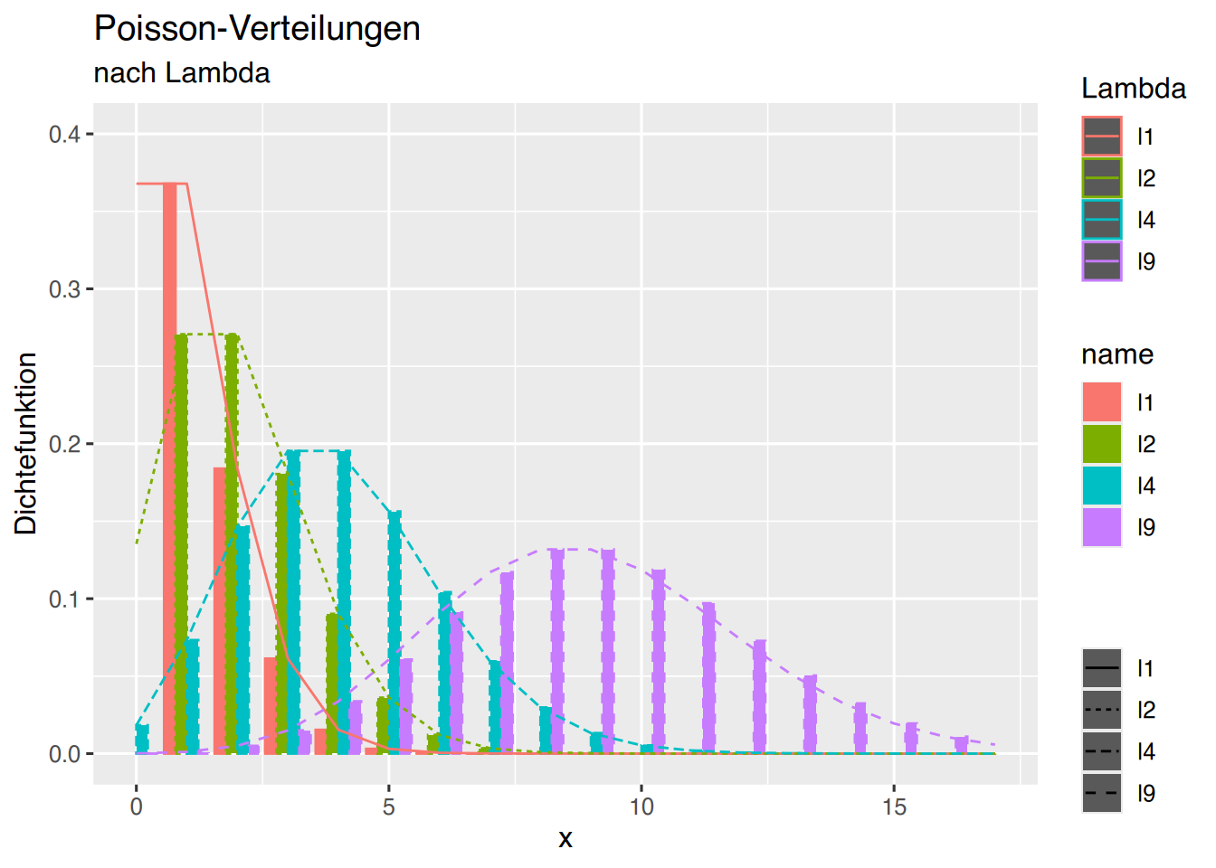
Möchte man einen Polygonzug, müssen als Ausgangspunkt die Koordinaten (0,0) festegelegt werden.
x=seq(0,25)#, by=0.005)
df <- data.frame(  x=c(0,x),
                   l1 = c(0, dpois(x, 1)),
                   l2 = c(0, dpois(x, 2)),
                   l4 = c(0, dpois(x, 4)),
                   l9 = c(0, dpois(x, 9))
)
df <- pivot_longer(df, cols=c(l1, l2, l4, l9))

p <- ggplot(data=df, aes(x, value, fill=name)) +
  xlim(0,17) + ylim(0, 0.4) +
  xlab("x") + ylab("Dichtefunktion") +
  ggtitle("Poisson-Verteilungen", subtitle = "nach Lambda")
p + geom_polygon(aes(col=name,linetype=name))+
  geom_line(aes(col=name),linetype="dashed")+
  labs(col="Lambda", fill="Lambda", linetype="Lambda")
## Warning: Removed 32 rows containing missing values or values outside the scale range
## (`geom_line()`).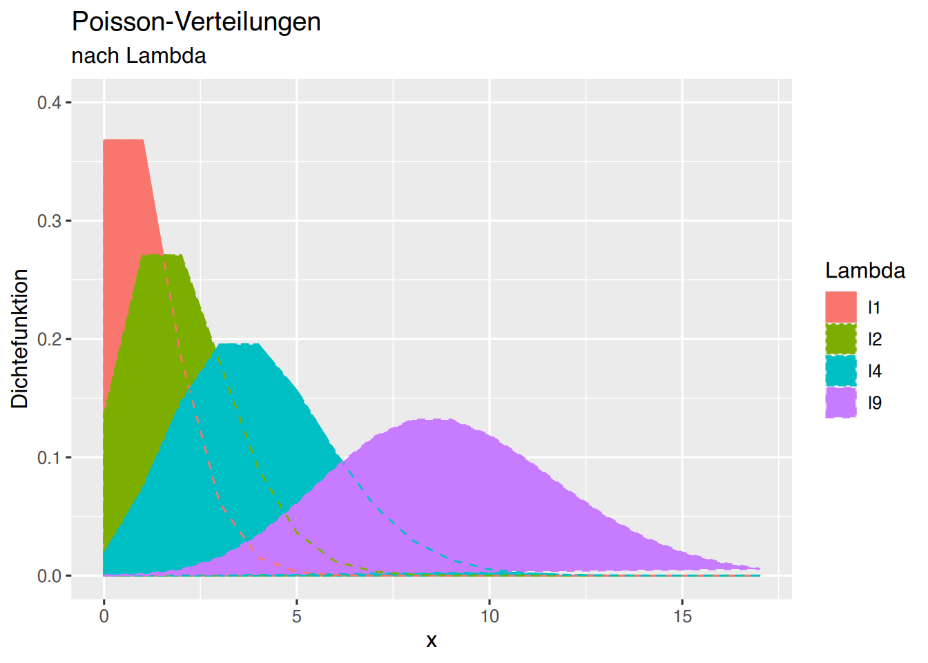
37.6 BMI-Gewichtskategorien
Wir benötigen eine Übersichtsgrafik, aus der hervorgeht, in welcher BMI-Klasse sich ein Patient in Abhängigkeit von Körpergröße und Körpergewicht befindet.
Erzeugen wir zunächst unsere Daten.
# BMI-Gewichtsklassen
Gewichtsklassen <- c(0, 18.5, 25, 30, 35, 40, 100)
# Schöne Farben
Farben <- c("skyblue4", "darkgreen", "yellow", "orange", "red", "darkred", "black")
# 100 Körpergrößen von 1,4m bis 2,2m
Koerpergroesse <- seq(1.4, 2.2, length = 100)

# Funktion um das BMI-Grenzgewicht pro Klasse
# für jede Körpergröße zu bestimmen
bmi.k <- function(groesse, konstant) {
  return(groesse^2 * konstant)
}
37.6.1 R base
Wir erzeugen das Diagramm mit der plot()-Funktion, wobei wir die Klassen als Polygone einzeichnen.
Ein Polygon wird so gezogen, als würden wir es mit einem Stift auf Papier zeichnen, ohne den Stift dabei abzusetzen. Das heisst, wir müssen “hin und zurück” zeichnen. Wir beginnen unten links, zeichnen von dort nach rechts, dann nach oben, und von dort wieder zurück nach links und wieder hinunter.
Für die Körpergröße (x-Achse) bedeutet das, dass wir die Körpergrößen in umgekehrter Reihenfolge an die “Originalreihe” kleben müssen, um wieder “zurück” zum Ausgangspunkt zu kommen.
Gross <- c(Koerpergroesse, rev(Koerpergroesse))Für die Klassengrenzen (y-Achse) benötigen wir für das “Zurückkehren” die Werte der nächsten Klasse in umgekehrter Reihenfolge.
# Berechne alle Klassengrenzen
Klasse1 <- c(bmi.k(Koerpergroesse, Gewichtsklassen[1]), rev(bmi.k(Koerpergroesse, Gewichtsklassen[2])))
Klasse2 <- c(bmi.k(Koerpergroesse, Gewichtsklassen[2]), rev(bmi.k(Koerpergroesse, Gewichtsklassen[3])))
Klasse3 <- c(bmi.k(Koerpergroesse, Gewichtsklassen[3]), rev(bmi.k(Koerpergroesse, Gewichtsklassen[4])))
Klasse4 <- c(bmi.k(Koerpergroesse, Gewichtsklassen[4]), rev(bmi.k(Koerpergroesse, Gewichtsklassen[5])))
Klasse5 <- c(bmi.k(Koerpergroesse, Gewichtsklassen[5]), rev(bmi.k(Koerpergroesse, Gewichtsklassen[6])))
Klasse6 <- c(bmi.k(Koerpergroesse, Gewichtsklassen[6]), rev(bmi.k(Koerpergroesse, Gewichtsklassen[7])))
Klasse7 <- c(bmi.k(Koerpergroesse, Gewichtsklassen[7]), rev(bmi.k(Koerpergroesse, Gewichtsklassen[8])))
Jetzt können wir das Diagramm plotten.
# Plotparameter festlegen
par(bg="whitesmoke")
plot(Koerpergroesse, bmi.k(Koerpergroesse, 18), type="n",
     xlim=c(1.60, 1.99), ylim=c(40, 125),
     xaxt="n", yaxt="n",
     cex.axis=1.4, cex.lab=1.3, cex.main=1.7,
     xlab="Größe [in m]", ylab="Gewicht [in kg]", main="Body Mass Index")

# Polygone der Gewichtsklassen einzeichnen
polygon(Gross, Klasse1, col=Farben[1])
polygon(Gross, Klasse2, col=Farben[2])
polygon(Gross, Klasse3, col=Farben[3])
polygon(Gross, Klasse4, col=Farben[4])
polygon(Gross, Klasse5, col=Farben[5])
polygon(Gross, Klasse6, col=Farben[6])
polygon(Gross, Klasse7, col=Farben[7])

# graues Gitter
box()
grid(lty="dotdash" ,col="darkgrey")
abline(v=seq(1.65, 1.95, by=0.1), h=seq(50, 110, by=20), lty="dotted", col="grey")

# Legendenbox
legend(x="bottomright", inset=0.005,
       legend=c("Untergewicht", "Normalgewicht", "Präadipositas",
                "Adipositas Grad I", "Adipositas Grad II", "Adipositas Grad III"),
       col=Farben, lwd=6, bg="skyblue")

# X-Achse in Groß
axis(1, at=format(seq(1.60, 2, by=0.1), nsmall=2),
     labels=format(seq(1.60, 2, by=0.1), nsmall=2), cex.axis=1.5)
# X-Achse Zwischenschritte in Klein und Grau
axis(1, at=seq(1.65, 2, by=0.1), cex.axis=1.2, col.axis="grey")
# Y-Achse Ticks
axis(2, at=seq(40, 120, by=10), cex.axis=1.5)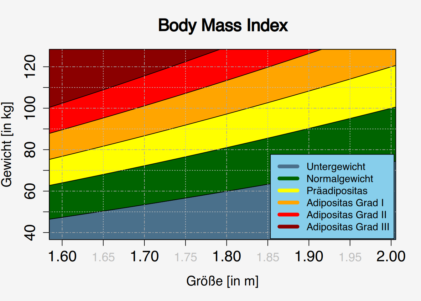
37.6.2 ggplot()
Schauen wir nun, wie wir das Diagramm mit ggplot() zeichnen würden. Dafür müssen wir die Daten zunächst als “long table” schreiben (siehe Kapitel 24). Wie Sie evtl. im obigen Beispiel bemerkt haben, kommt Klasse7 in den Plotdimensionen gar nicht vor, daher lassen wir sie direkt weg.
# bereite "long table" vor
df1 <- data.frame(Gross, Wert=Klasse1, BMI="Untergewicht")
df2 <- data.frame(Gross, Wert=Klasse2, BMI="Normalgewicht")
df3 <- data.frame(Gross, Wert=Klasse3, BMI="Präadipositas")
df4 <- data.frame(Gross, Wert=Klasse4, BMI="Adipositas I")
df5 <- data.frame(Gross, Wert=Klasse5, BMI="Adipositas II")
df6 <- data.frame(Gross, Wert=Klasse6, BMI="Adipositas III")
# schreibe alles ins Datenframe df
df <- rbind(df1, df2, df3, df4, df5, df6)
df$BMI <- factor(df$BMI, ordered = TRUE,
                 levels=c("Untergewicht", "Normalgewicht", "Präadipositas",
                          "Adipositas I", "Adipositas II", "Adipositas III"))
Das geht auch auf diese Weise:
df <- data.frame(Gross=rep(Gross, 6),
                 Wert=c(Klasse1, Klasse2, Klasse3, Klasse4, Klasse5, Klasse6),
                 BMI=factor(c(rep("Untergewicht", 200), rep("Normalgewicht", 200),
                              rep("Präadipositas", 200), rep("Adipositas I", 200),
                              rep("Adipositas II", 200), rep("Adipositas III", 200)),
                            ordered=TRUE,
                            levels=c("Untergewicht", "Normalgewicht", "Präadipositas",
                                     "Adipositas I", "Adipositas II", "Adipositas III")
                            )
                 )
Nun können wir die Daten an ggplot() übergeben.
## Plotten mittels ggplot
library(ggplot2)
ggplot(df) + aes(x=Gross, y=Wert, fill=BMI) +
  geom_polygon()+
  coord_cartesian(xlim = c(1.55, 2.05), ylim = c(35, 125), expand = FALSE)+
  scale_fill_manual(values = Farben) +
  theme(legend.position = c(0.9, 0.2))
## Warning: A numeric `legend.position` argument in `theme()` was deprecated in ggplot2
## 3.5.0.
## ℹ Please use the `legend.position.inside` argument of `theme()` instead.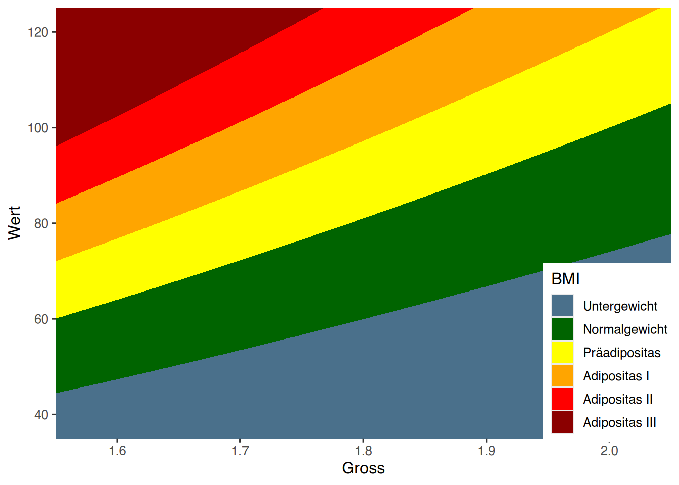
37.6.2.1 Alternative
Eine alternative Lösung kann mit geom_contour_filled() erreicht werden. Dieses Geom kennt außer x und y noch eine zusätzliche virtuelle z-Achse. Wenn wir das Gewicht auf der y-Achse darstellen wollen, und die Körpergröße auf der x-Achse, so können wir auf der virtuellen z-Achse den jeweils dazugehörigen BMI-Wert angeben. Dem Geom geom_contour_filled() können wir dann über den breaks-Parameter die BMI-Grenzwerte mitteilen, und die jeweiligen Bereiche manuell einfärben.
Zunächst erzeugen wir mittels expand.grid() eine Tabelle mit Kombinationen von Körpergröße und Gewicht.
# erzeuge alle Kombinationen von
# Körpergröße und Gewicht
df <- expand.grid(Gewicht = seq(30, 130, 0.1),
                  Größe = seq(1.5, 2.1, 0.01))
# erste Zeilen anzeigen
head(df)
## Gewicht Größe
## 1 30.0 1.5
## 2 30.1 1.5
## 3 30.2 1.5
## 4 30.3 1.5
## 5 30.4 1.5
## 6 30.5 1.5Jetzt können wir ggplot() wie folgt aufrufen:
library(ggplot2)
ggplot(df) +
  aes(Größe, Gewicht) +
  # berechne für "z" den BMI (kg/m^2)
  geom_contour_filled(aes(z = Gewicht/Größe^2),
                      # schwarzer Rahmen
                      color = "black",
                      # BMI Grenzwerte
                      breaks = c(0, 18.5, 25, 30, 35, 40, 100)) +
  # manuell umfärben und umbenennen
  scale_fill_manual("BMI",
                    values = rev(c("#8b0000", "red", "#ffa500", "yellow",
                                   "#006400", "#4a708b")),
                    labels=c("Untergewicht", "Normalgewicht", "Präadipositas",
                             "Adipositas I", "Adipositas II", "Adipositas III")) +
  # Plot-Dimensionen festlegen
  coord_cartesian(xlim = c(1.55, 2.05),
                  ylim = c(35, 125),
                  expand = FALSE) +
  # X-Ticks
  scale_x_continuous(breaks = seq(1.6, 2.0, 0.05)) +
  #Y-Ticks
  scale_y_continuous(breaks = seq(40, 120, 10) )+
  # legendenbox innerhalb des Plots platzieren
  theme(legend.position = c(0.88, 0.25)) +
  # Graues Gitter per vline und hline hinzufügen
  geom_vline(xintercept = seq(1.55, 2.05, 0.01),
             linetype = "solid",
             color = "gray",
             size = 0.1,
             alpha=0.3) +
  geom_hline(yintercept=seq(36, 124, 2),
             linetype="solid",
             color="gray",
             alpha=0.3)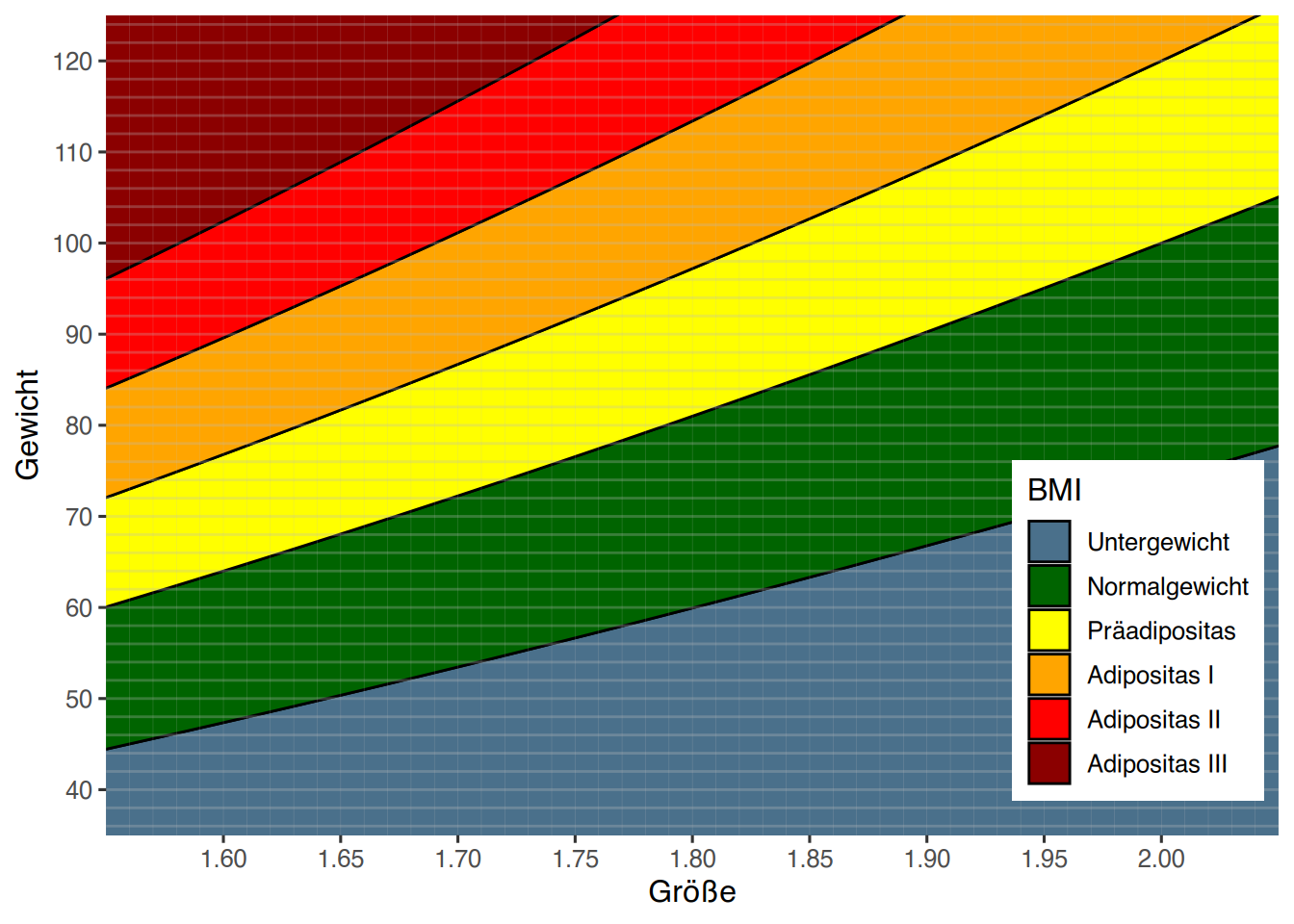
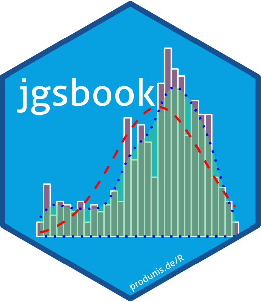
37.7 Wie hast du das Titelbild erzeugt?
Das Titelbild ist mit der Altersverteilung aus dem epa-Datensatz erstellt.
# datensatz laden
epa <- jgsbook::epa

# ggplot
library(ggplot2)

# plotten
ggplot(epa) +
  aes(x=age) +
  geom_histogram(aes(y=after_stat(density)),
                 color="white",
                 fill="#8a658a") +
  stat_density(geom="area",
               color="blue",
               fill="seagreen3",
               linetype="dotted",
               alpha=0.5)+
  stat_function(fun=dnorm,
                args=(c(mean=mean(epa$age),sd=sd(epa$age))),
                color = "red", lwd=1.5,
                linetype = "dashed") +
  theme_void()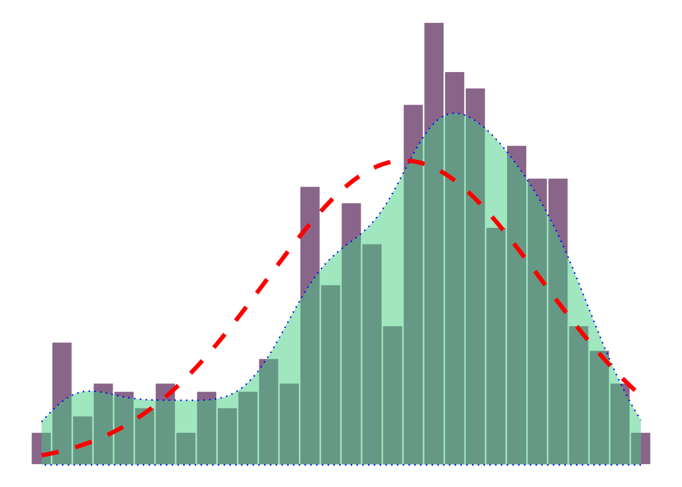
Mit dem Paket hexSticker kann daraus ein schöner Hex-Sticker erstellt werden.
library(hexSticker)
# Titelbild in Objekt speichern
titelbild <- ggplot(epa) +
  aes(x=age) +
  geom_histogram(aes(y=after_stat(density)),
                 color="white", lwd=0.3,
                 fill="#8a658a") +
  stat_density(geom="area",
               color="blue",
               fill="seagreen3",
               linetype="dotted",
               alpha=0.5)+
  stat_function(fun=dnorm,
                args=(c(mean=mean(epa$age),sd=sd(epa$age))),
                color = "red",
                linetype = "dashed") +
  theme_void()

# Sticker erzeugen
sticker(titelbild, package="jgsbook", p_color="white", p_x=0.7, p_size=20,
        s_x=1.05, s_y=1.06, s_width=1.5, s_height=1.4,
        h_fill="#07A1E2", h_color="#185191",
        url="produnis.de/R", u_size=5, u_color="white",
        filename="jgsbook-hexsticker.png")